Designing labels for a new range of CBD-based body oils for the Spa industry requires a thoughtful approach that balances the product’s therapeutic benefits with its luxury positioning.
The design process should effectively convey the product’s advantages,
reflect the brand’s ethos, and resonate with spa clientele.
The design process should effectively convey the product’s advantages,
reflect the brand’s ethos, and resonate with spa clientele.
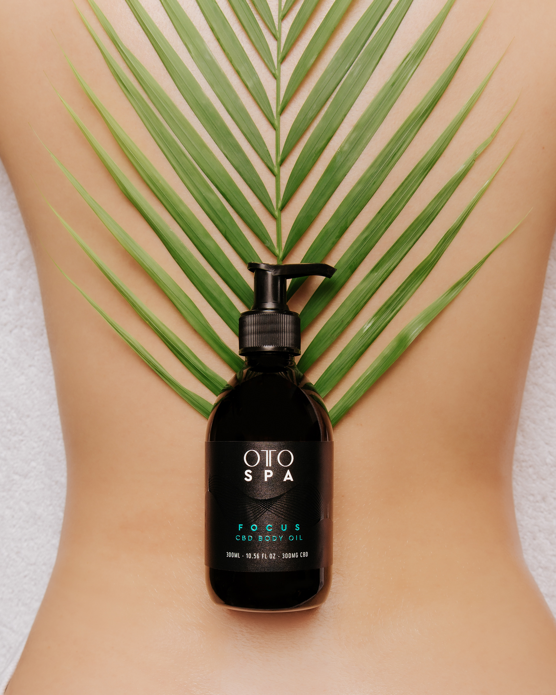
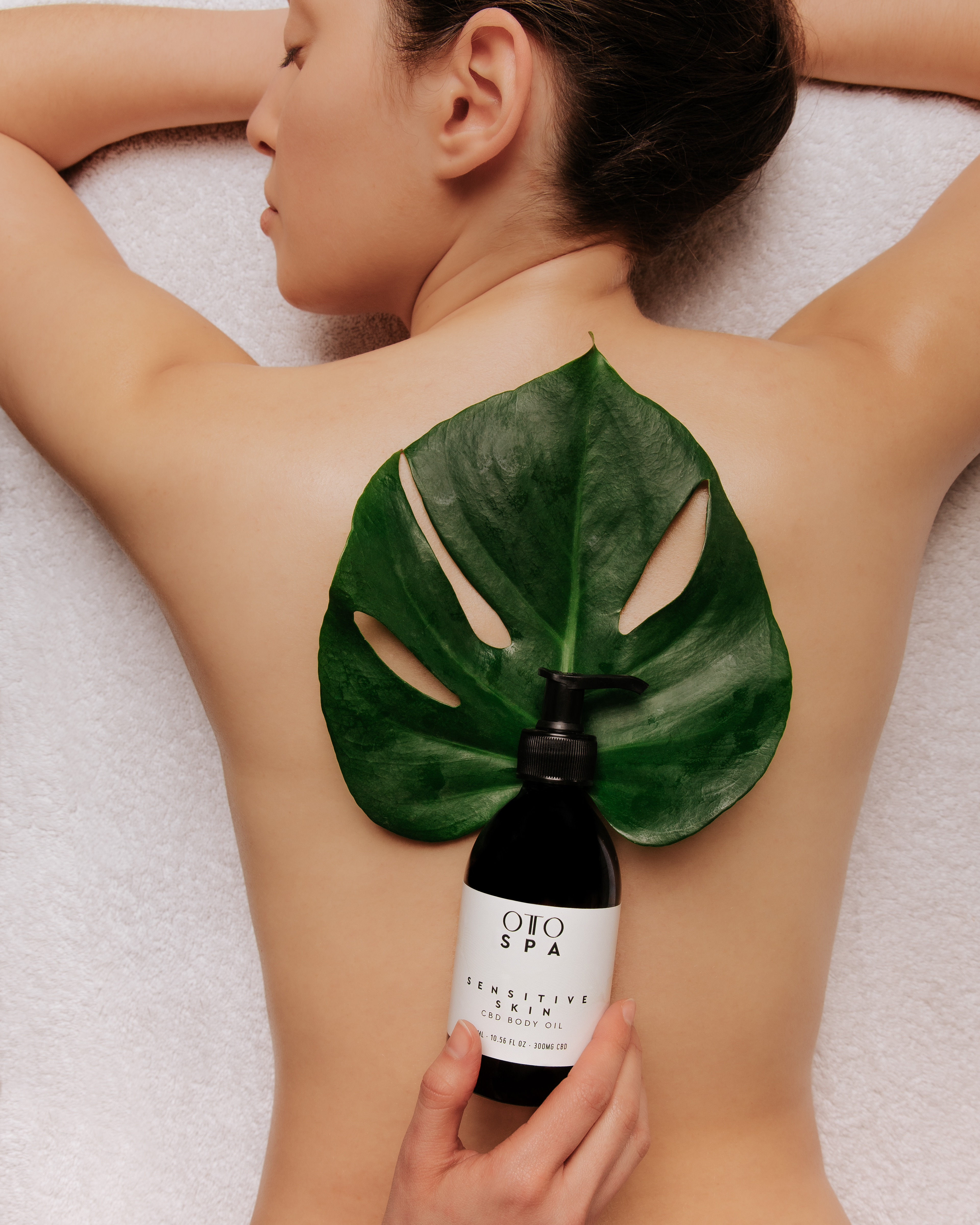
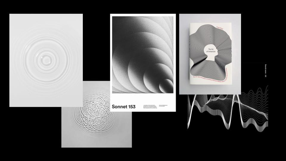
OTO’s brand embodies wellness, balance, and natural therapy. The label design must convey calm, luxury, and efficacy. Inspired by sound waves, my concept integrates their fluid shapes as design elements, reflecting the synergy of CBD and sound healing in OTO’s innovative spa oils.
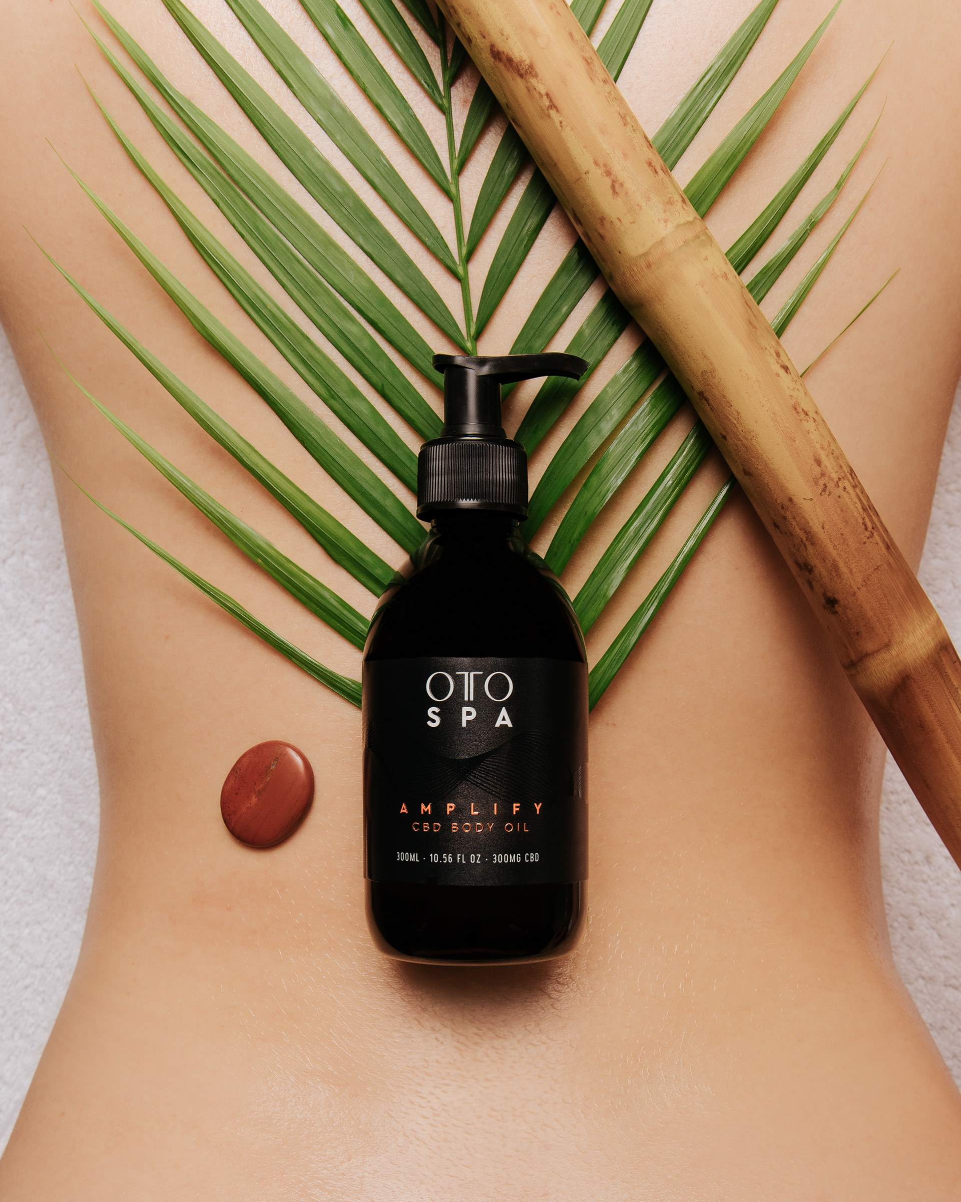
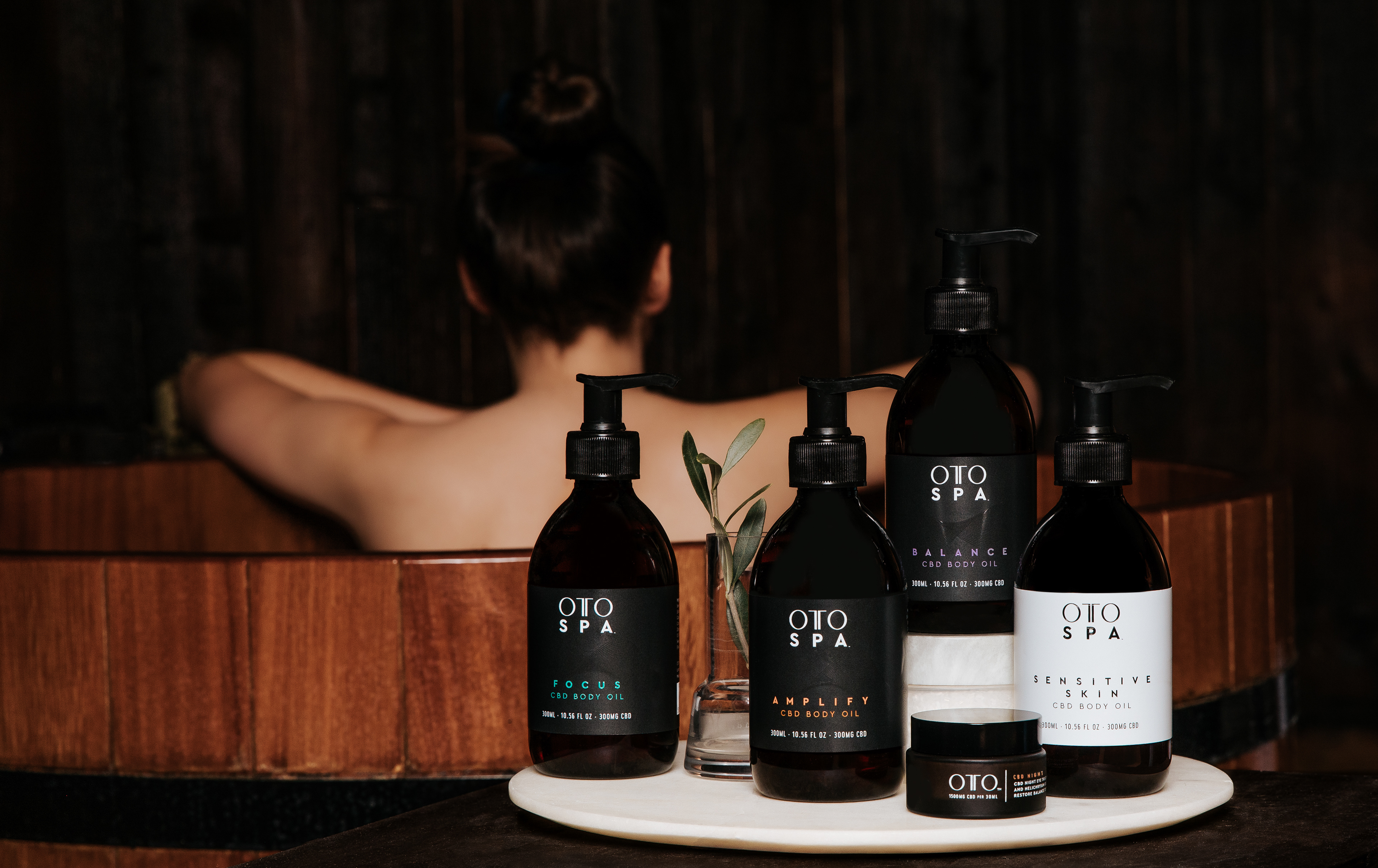
The label design visually distinguishes OTO’s pillars—FOCUS, AMPLIFY, BALANCE, and SUPER SENSITIVE—while maintaining a cohesive look.
We developed a color palette reflecting each pillar’s essence and collaborated with production to subtly integrate sound waves using foil and embossing, ensuring a polished, elegant result.
We developed a color palette reflecting each pillar’s essence and collaborated with production to subtly integrate sound waves using foil and embossing, ensuring a polished, elegant result.