Logo redesign, packaging and website design for Propolise, a natural skincare brand from North Wales.
As the brand grew, its existing visual identity no longer captured the quality or authenticity of its products. The redesign aimed to elevate Propolise into a contemporary yet grounded brand that reflects its
Welsh roots, craftsmanship, and connection to nature - while supporting a transition from wholesale
to direct online sales.
Welsh roots, craftsmanship, and connection to nature - while supporting a transition from wholesale
to direct online sales.
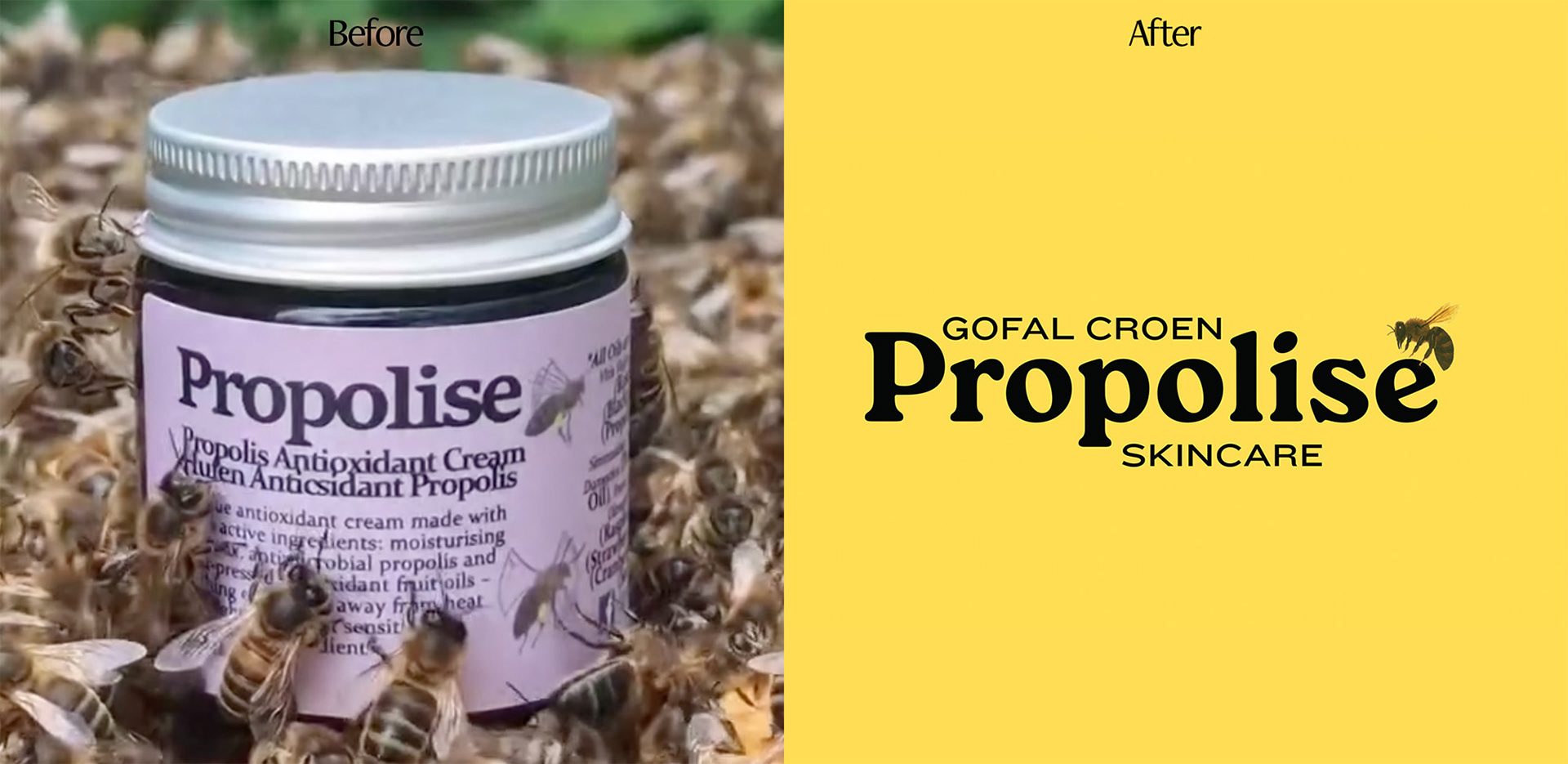
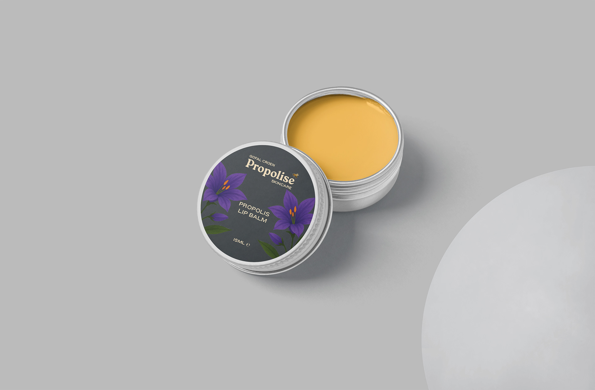
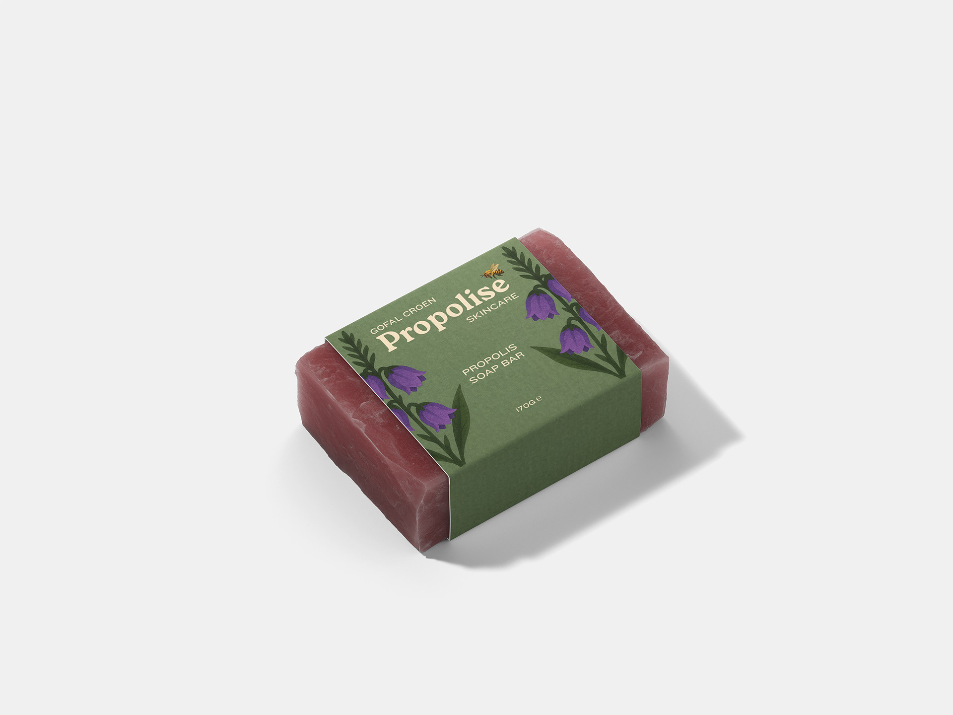
The new logo retains the recognisable strength of the original wordmark but refines it into a bold serif
with softened, organic contours - echoing both the rugged landscapes of Snowdonia and the handcrafted quality of the products. A hand-painted bee illustration brings a touch of warmth and character,
tying directly to the brand’s natural ingredient focus.
Typography was simplified for clarity: a serif for the brand name to convey heritage
and trust, paired with a modern sans-serif for supporting text.
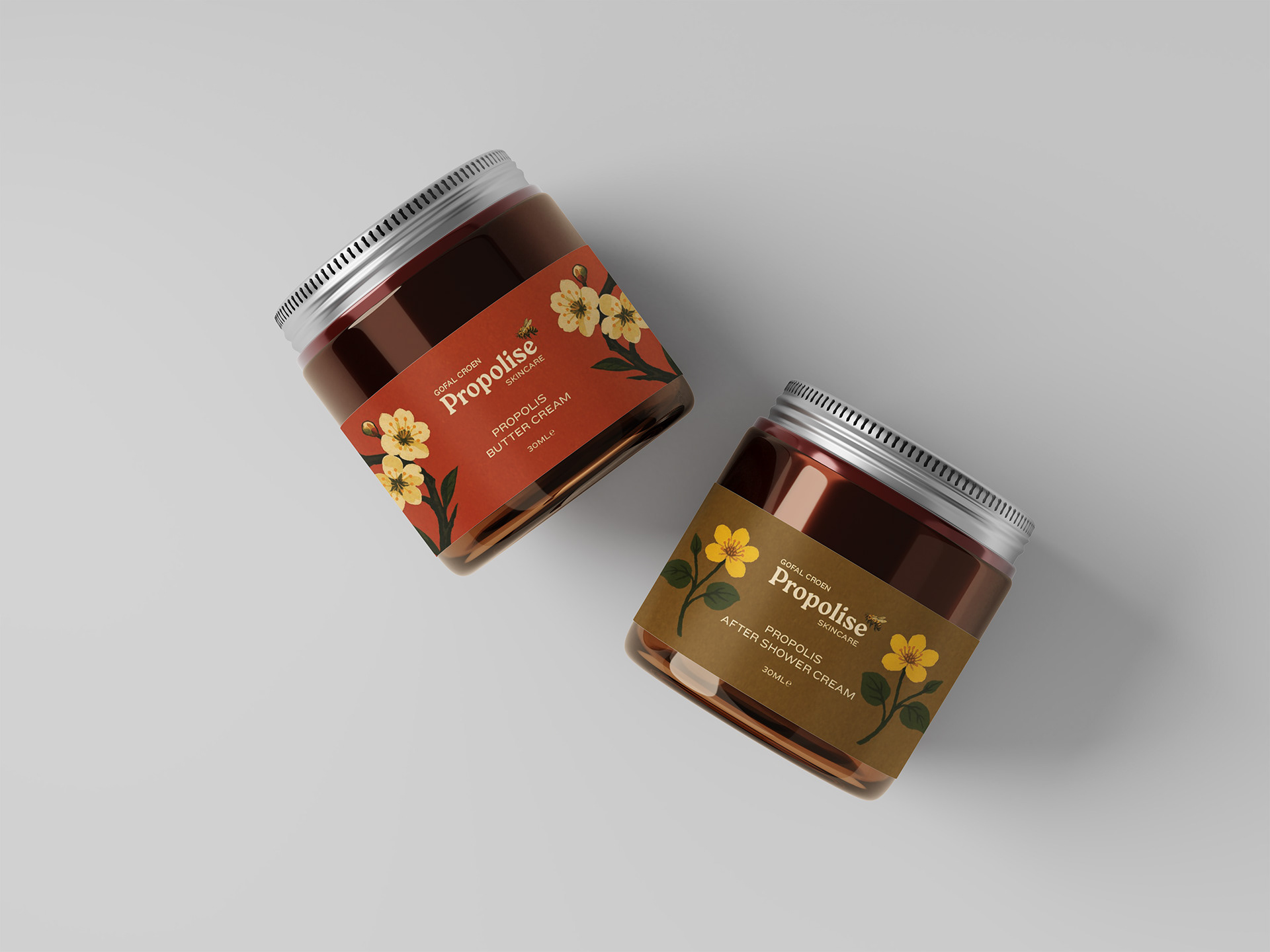
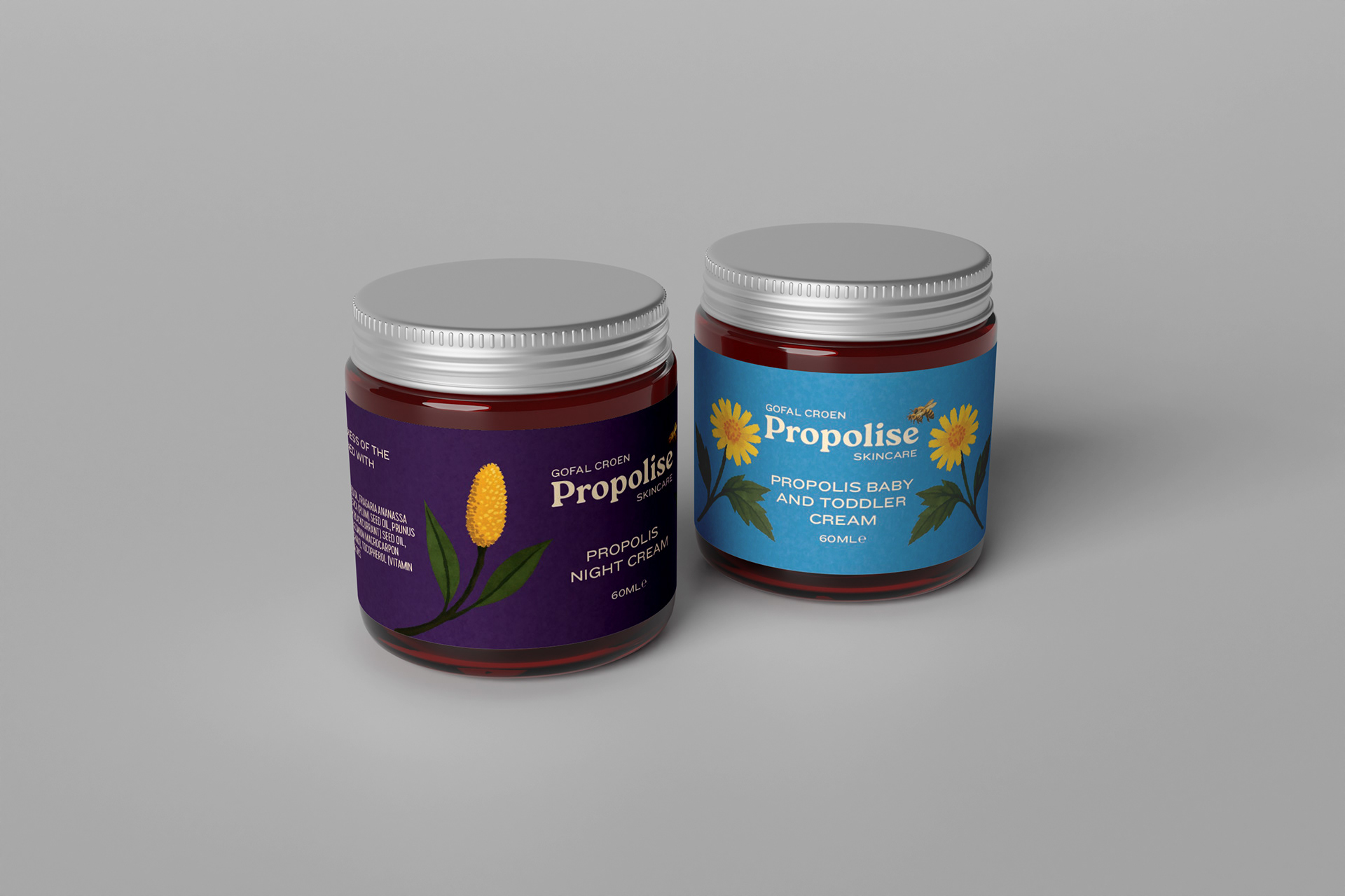
A natural, earthy palette - honey yellow, amber, moss, and slate - communicates purity and resilience
while remaining unisex and approachable. Packaging integrates bilingual text and natural imagery
inspired by North Wales flora, reinforcing a sense of place and purpose.
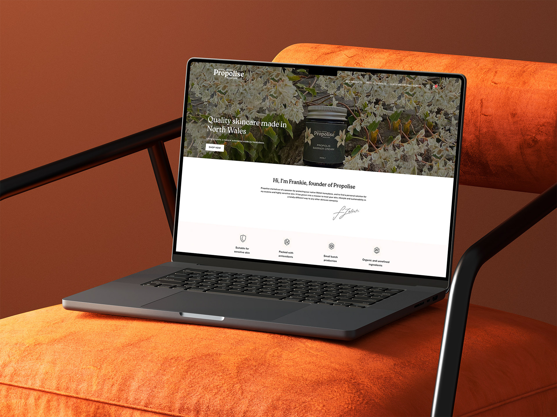
The refreshed identity and website position Propolise as a confident, authentic and modern
natural skincare brand. The cohesive bilingual packaging and visual storytelling
strengthen brand recognition, while the new e-commerce site enhances
direct engagement with customers and supports future product launches.
with softened, organic contours - echoing both the rugged landscapes of Snowdonia and the handcrafted quality of the products. A hand-painted bee illustration brings a touch of warmth and character,
tying directly to the brand’s natural ingredient focus.
Typography was simplified for clarity: a serif for the brand name to convey heritage
and trust, paired with a modern sans-serif for supporting text.
A natural, earthy palette - honey yellow, amber, moss, and slate - communicates purity and resilience
while remaining unisex and approachable. Packaging integrates bilingual text and natural imagery
inspired by North Wales flora, reinforcing a sense of place and purpose.
The refreshed identity and website position Propolise as a confident, authentic and modern
natural skincare brand. The cohesive bilingual packaging and visual storytelling
strengthen brand recognition, while the new e-commerce site enhances
direct engagement with customers and supports future product launches.
This project was executed with the team at Tropic.Studio.